 We’re Americans, so we demand our freedom of choice!
(If you’re not American, please grab an oversized plate of nachos, a made-in-China American flag and pretend for a moment.)
Jam and The Power of Choice
One of my favorite pieces of research is often simply referred to as the Jam Study, and it goes like this:
Sheena Iyengar, a professor of business at Columbia University, set up a tasting station at a gourmet market, with alternately six or twenty-four flavors of jam. Sixty percent of customers were drawn to the table when the larger assortment was available, while only 40% came by the smaller assortment.
Tasters were then offered a $1 coupon off a jar of jam.
Here’s the kicker: while 30% of the small sample customers purchased a jar of jam, only three percent from the large sample did!
Why is this? Perhaps twenty-four flavors is just too much choice. People were paralyzed with this much choice, and fear of making the wrong choice.
And this is jam, people! I mean, how wrong can you go with jam?!? 😀
How Does This Impact Your Website?
Providing Guidance at Your Website
Simplify navigation.
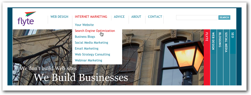
- Limit your navigation to six primary items. There’s only so much attention your visitor can give your page. Every button you add reduces the importance of every other button in your navigation. If you can’t seem to reduce the primary navigation to six buttons, try moving some items into secondary (fly-out or drop-down) navigation.

- Stop at secondary navigation. Even if your navigation goes three levels deep, don’t use tertiary fly-out menus. They require a very steady hand from your visitor and clutter your page with too many choices.
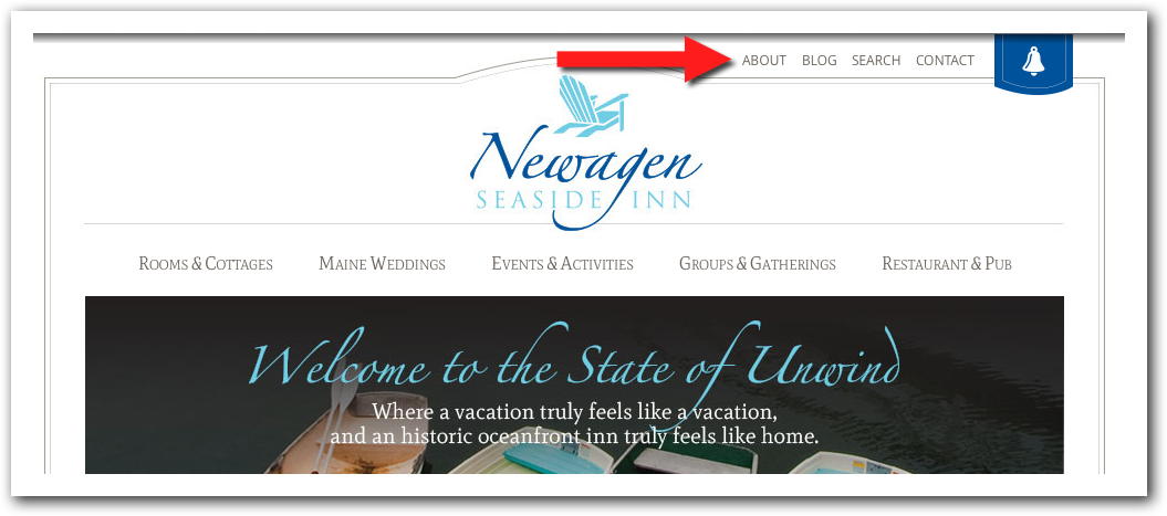
- Move “meta” links out of the navigation bar. If you can’t seem to get down to six primary navigation buttons consider moving links like Home, About, Contact, Privacy, etc., out of the primary navigation area and turn them into smaller text links at the top and bottom of each page.

Provide some self-selection.
If you’re dealing with multiple audiences, you may need to provide more individualized guidance for each group.
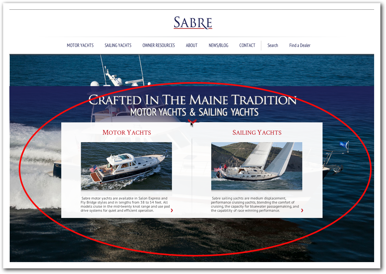
One of the easiest ways to do this is to create “boxes” on your home page that identify each audience with a link to a page where that audience can learn more, and where you can provide more individualized guidance.
Your audiences may be Parents, Teachers & Counselors, or Small Businesses, Non-Profits and Marketers. Well-chosen images and targeted copy can help guide visitors to a solution tailor-made for their needs.

Ahhh…to have choices like these.
Offer fewer calls to action.
Studies have shown that conversion rates go up when websites only offer one call to action rather than several.
While it’s not always possible to offer only one call to action, are you offering too many? What’s the most important action a visitor can take on a given page? Can you remove all other calls to action?
If you must offer choices, make a recommendation.
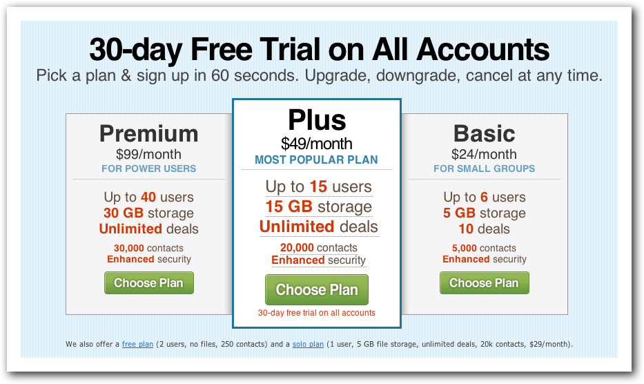
Sometimes you have to offer visitors choices, especially in terms of pricing and service plans. If you do, try and keep the choices down to three. (Three seems to be a magic number.)
Still, when you offer three price points, you are providing people with two “wrong” answers. The odds are against them in choosing the right option! To help them out, to reduce their fear of getting it wrong, you should provide a recommended choice.
You could sell it as Recommended, Best Choice, Most Value or Most Popular. It doesn’t matter. What matters is that you’re providing guidance. If people choose the more expensive or less expensive option, that’s fine; it may be the right choice for them, but for the majority of the population you’re providing an easier path to success.

37 Signals offers multiple pricing options for their Basecamp product, but why wouldn’t most people choose their “Most Popular Plan?”
Make it easy to contact you.
Sometimes the best way to provide guidance is to talk to people directly, and that may be just what they’re looking for.
If you want people to call you for help, make sure your phone number is big and bold at the top of each page. Pro tip: don’t turn your phone number into an image; instead, keep it as text. When people access your website on a smart phone, a text link becomes a clickable link, making it easier for people to call you.
If you want people to fill out your contact form, keep it short and require as few fields as possible. Name, email, & phone may be all you need to ask for to start a conversation. Make any other fields optional and you’re removing barriers, making it easier for your visitors to get help and guidance from you.
Takeaways
While people claim to want freedom of choice–and we do–when it comes to a complex sale, or jam, too much choice can be overwhelming and paralyzing.
Since paralyzed prospects don’t often buy, it’s up to you to develop a website that provides recommendations and a clear, guided path to success.
Are there any opportunities for you to improve your own website? What are you going to work on FIRST? Let me know in the comments below!
And if you haven’t yet, please consider signing up for free updates from The Marketing Agents! 100% high-quality content without the spam you often find at other websites. 😉